Plot a metric distribution density and histogram
plot_qc_density.RdThis function plots a histogram and the estimated density curve. Histogram can be colored according to a categorical variable. Histograms are stacked.
Usage
plot_qc_density(
  df,
  x = "nFeature_RNA",
  group_by = "orig.ident",
  group_color = NULL,
  x_thresh = NULL,
  bins = 30
)
Arguments
- df
DATAFRAME : For instance, it could be
sobj@meta.data(no default)- x
CHARACTER : a numeric column name in df, to make the histogram and density for (default to "nFeature_RNA")
- group_by
CHARACTER : a categorical column name in df, to color histogram by. To remove color, set it to NULL (default to "orig.ident")
- group_color
NAMED VECTOR : a vector, named by levels of group_by, to customize histogram color. By default, it takes ggplot default colors (default to NULL)
- x_thresh
NUMERIC : one or more numeric value.s to add a vertical line on the figure (default to NULL)
- bins
NUMERIC : number of bins for histogram (default to 30)
Examples
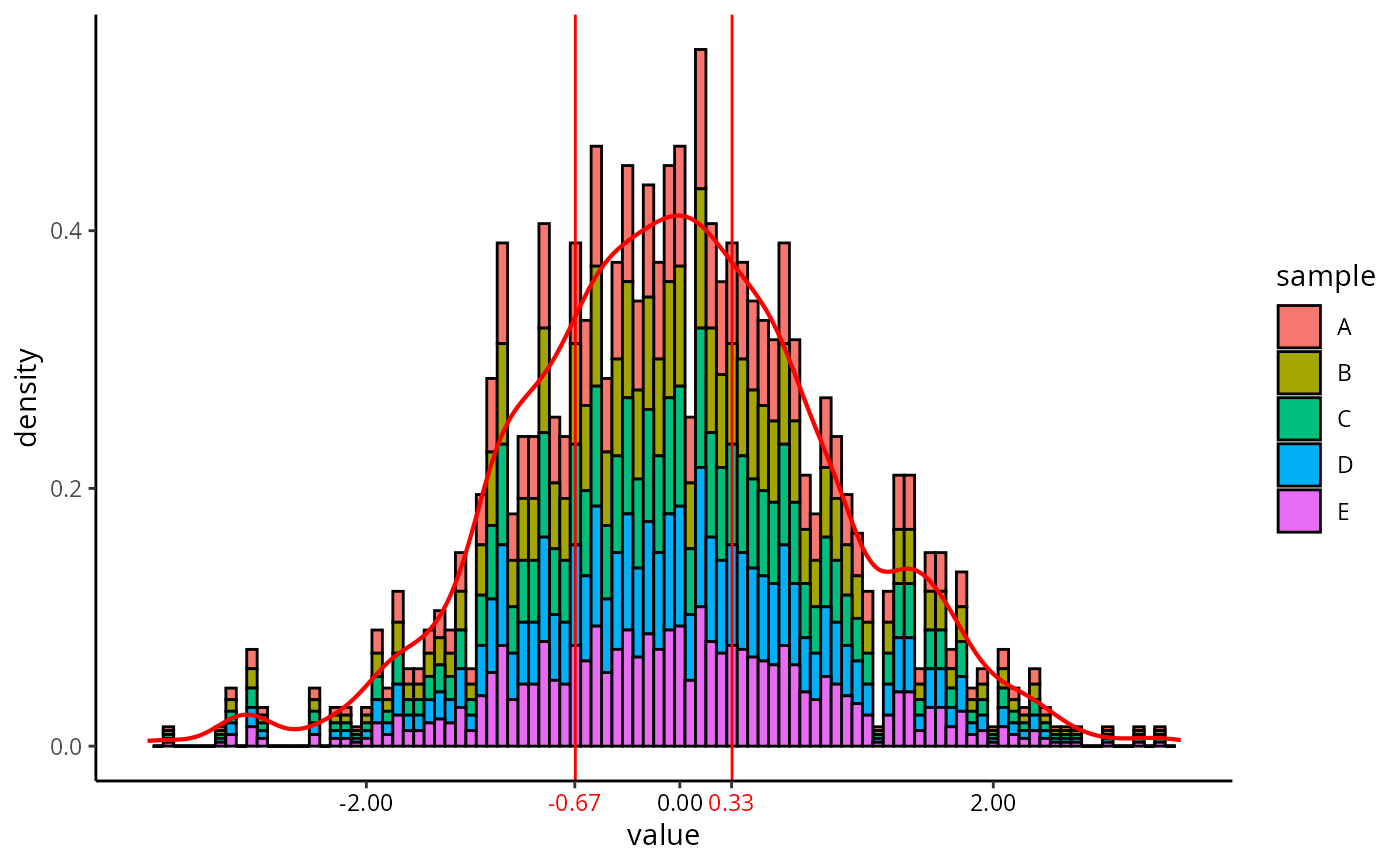
set.seed(1234)
df = data.frame(value = rep(rnorm(n = 1000), times = 5),
                sample = unlist(lapply(LETTERS[c(1:5)], FUN = rep, times = 1000)))
df$sample = as.factor(df$sample)
plot_qc_density(df,
                x = "value",
                group_by = "sample",
                x_thresh = c(-2/3, 1/3),
                bins = 100)
#> Warning: Vectorized input to `element_text()` is not officially supported.
#> ℹ Results may be unexpected or may change in future versions of ggplot2.
#> Warning: Removed 10 rows containing missing values or values outside the scale range
#> (`geom_bar()`).